 README.TXT (intro)
Hello there! Welcome to the bflyt guide.
In reality, this is less of a “tutorial” and more of a “guide,” or resource as the cool kids call it. There will be tutorials involved, of course, but the actual content of this is all of the information I’ve learned abt the bflyt files, and maybe in a broader sense, the ui2d system as a whole in the game. This guide is intended for people familiar with layout editing, and is more focused on specific techniques/knowledge/organizational advice that you can’t find in those existing guides. If you need introductory documents, or even if you’re well versed in the subject, I suggest you read through the tutorials and guides linked in Existing References.
FAQ:
- “How do I put these two layout.arc mods together???”
- You don’t :D (unless you know what you’re doing!)
- “I am having X issue. What do?”
- Common issues when making mods, and how to solve them
- UI looks kinda broken/different than it looks like in toolbox
- could be numerous things, if it looks broken that’s probably toolbox’s fault, so use switch layout editor to edit it. If its colors/positions/etc it could be part pane shenanigans (I get into that in here) or an animation thing.
- Animation not playing as it looks in toolbox
- same as last point. double check the animation guide to make sure u configured the anim properly.
- Combiner setting output looking different than in toolbox
- can’t help ya there, sometimes it's a hit sometimes it's a miss.
- toolbox view looks so fricked up. it wasnt always like this
- you can either restart the program or type something into a part pane’s part name setting (it’ll force refresh the view for some reason)
- im getting an error!
- index error: look around in SLE to see if any of the material ID’s are fucked up (set to 65535). change it to like 1 or 2 and it should load. preferably you set it to what its material actually should be.
- other error: idk lmao
ui2d: introduction
Super Smash Bros Ultimate, like many other Nintendo games, uses a system of ui called “ui2d” internally. As someone who took a single Intro to Python class I have no idea how the code behind all this functions. What I DO know, however, is how the file is laid out, what does what, and where things are. I’ve ran through a ton of them, and I think I may as well document it too. Consider this a librarian’s guide; I’ll show you where everything is at, but it’s up to you to figure out what you wanna look into and mess with. Aside from specific use cases. Those are just straight up tutorials..
There will also be sections which briefly go over some of the .lua files and some of the programmatic UI examples which may be relevant to your projects. As stated, although I’m not entirely sure how they function I do know where these resources are and I’ll try and direct you to them if you wish to learn more about them from people who specialize in that area.
Some important things to know about Smash Ultimate’s UI as we move forward:
- Although it’s called ui2D & uses flat, depthless panes to display things, it’s possible to add perspective (called PerspectiveMode) and give the illusion of 3D in certain layout files (BFLYT) by skewing the panes. It’s a layout-specific setting that’s used in the Main Menu & the Results screen in the base game. There’s an in-depth section on this here.
- All panes exist on separate planes, and are affected by the placement/status of their parent pane. So if you scale down RootPane (the parent of all panes) or move it 1000 units away, all its children panes are scaled down or moved with it. If a parent pane has Visibility unchecked/set to 0, so do its children. Very realistic gameplay design, kudos to the team.
- Unlike some other games (cough cough BoTW/ToTK) Smash Ultimate names and structures their files in a sane manner. The long, laggy abominations that most layout files consist of in other ui2d games are nowhere to be found here. Most menus are separated by screen, and labelled as such in their own independent archives (.arc). So if you’re coming from those games to mod smash UI, or you’re using this guide for your Zelda modding adventures, just know that Smash is very well suited for UI edits (relatively). So don’t let it intimidate you.
- Smash uses version 9 of the BFLYT format, which is (afaik) the most or one of the most recent versions of the format. There are other tools/guides for older versions of the format, such as those used on the Wii U or 3DS, and for the most part the guides will carry over. But be aware that they are NOT the same and the tools for the Wii U/3DS will NOT always work seamlessly with Smash (or any other switch game using that format, really).
- UI editing is fun and despite the limited interest, it’s a very accessible area of Smash Ultimate modding that I hope more people will dig into as time goes on. Although the tools aren’t perfect (we’ll get into that)
Existing References (Recommended Reading)
-Toolbox BFLYT guide
-Layout Editor guide
-BFLYT file structure guide*
-This guide was built around a slightly older version of the format for the 3DS. Though I’ve never ran into issues for the more modern switch games while using this guide, I can’t confirm that all of it is relevant or accurate to the newer format.
-Themezer LayoutDocs*
-Probably the most well researched/in-depth guide for editing bflyt files, but it’s geared towards the horizonOS menus and Switch Layout Editor. This guide is specifically geared towards Smash Ultimate and Switch Toolbox.
Okay, now that you’ve read the required reading and got allat done, let’s get to the actual guide part. Like the previous BFLAN guide, I’ll be focusing mainly on toolbox because of its useful features like animation previews & etc. I will also be covering Switch Layout Editor specific functions, as well as hex-specific functions.
Toolbox Vs Switch Layout Editor
Here’s a handy graph to help you see the biggest differences:
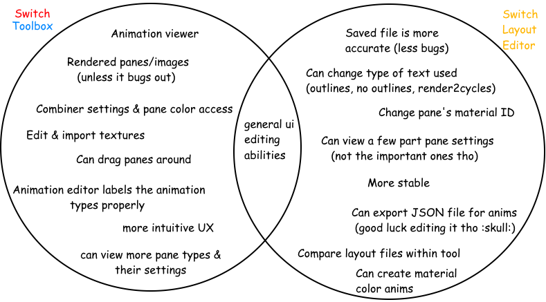
Overall, both tools have their uses. Their most significant differences are SLE’s ability to save files more accurately (which is a lifesaver for certain files that break somewhere in Toolbox like battle UI & the pause menu) & change a pane’s material ID, and Toolbox’s wider array pane settings/ability to render panes & animations mostly accurately, barring bugs. If you want the best shot at editing everything and anything in the game, and want to further your UI craft, you’ll need to learn about both of these tools’ functions and organize your work around flipping back and forth between them (until a better all around tool is made). It’s really not that much, though. You can get it down with only a little practice and intuition, and I’ll help you see some use cases where both may be needed. I believe in you!
Textures:
Textures function like any other smash textures. However, it’s important to note what kind of texture formats u might want to use (so I’ll do that here)
General use formats for all color textures w/transparency (in order of quality, highest to lowest)
- R8G8B8A8 (recommended for colored textures requiring transparency and get jagged edges with BC7, highest quality)
- BC7 (recommended for most textures; usually your best bet between size & quality)
- BC3 (recommended for indecisive people)
- BC2 (no one uses this)
- BC1 (Recommended)
Formats for B&W textures/masks (commonly used for things like button pieces)
- BC4 (my pick)
- BC5/6 (idek if this is used in smash)
make sure that when you’re importing textures, mipmaps are set to 1 and Swizzle is set to 0. also, you can enable multi-threading but the gamma fix usually isn't necessary.
Materials:
Materials in regards to UI, just like the materials you may be familiar with for character models, can influence the way that panes appear in game. They’re responsible for several things, including but not limited to:
- The actual texture on the pane*
- including tex coordinates & UVs
- can be overridden by an animation or by code
- The colors of the texture(s), but not the pane itself
- Blend & combiner settings
In SLE (Not toolbox), you can assign materials to panes manually. This is especially useful if you delete a pane that the game doesn’t like and need to set the materials for the panes back properly. Sometimes, certain actions in toolbox will set materialIDs to 65535 or FF FF if you’re a hex maniac (one of the many bugs within toolbox).
In Toolbox (Not SLE), you can edit material information. Why does SLE not let you mess with material information aside from what textures are assigned, and what kind of wrappings it has? IDK! but this is why its best to learn both tools.
Material Information:
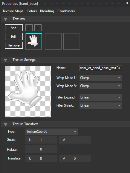
- Contain controls for textures, wrap modes, and the SRT parameters for a texture (this is separate from the SRT controls of the actual panes/bflyt, and exists on its own plane relative to the single pane these textures are displayed on
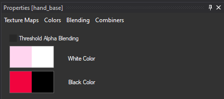
- Control the colors of the texture(s) in Texture Maps. Can affect the dark & light values of textures & the transparency of a texture. The first “block” represents color, and the second represents transparency (white is visible & black is invisible). For imported textures to display with their own colors set the White Color blocks all white and set the Black Color blocks all black.
- Toolbox has a bug where it’ll override what you set here if you play a material color animation. If your colors look weird, that’s why!
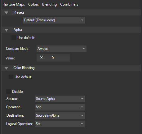
- The Blending tab is one of the most useful tabs available. Not only does it make it possible to do pane masking (which is elaborated on further in a later section), but it also allows for textures to have different properties (like being processed with inverted colors). I haven’t done much research on them, but there is a guide here that goes into great depth about the math behind the operations.
The Alpha tab controls how strict the transparency controls are (always @ 0 will process most stuff normally, but setting it to higher numbers will make the game cut more and more of the texture out).
Toolbox is okay at displaying these setting properly, but it cannot be trusted blindly & more research is needed. One day i may make a directory of settings that have worked for me & what they function as, but for now I’ll leave the experimentation up to the user. Trial and error, baby!
Blend Setting Directory (SMASH ULTIMATE ONLY? IDK)
- This directory is structured in the following way:
- Alpha: Value
- Source
- Operation
- Destination
- Logical Operation
- CHARACTER MASK BLEND (make stage background black)
- ALWAYS: 0 (may use GREATER: 0.9) if you are masking an img and it wont show up)
- sourceinvalpha
- reversesub
- destalpha
- disable
- CHARACTER REVERSE MASK BLEND (make character black)
- GREATER: 0
- sourcealpha
- reversesub
- destinvalpha
- disable
- INVERT COLOR BLEND (invert all element colors below this pane)
- ALWAYS: 0
- sourcealpha
- sub
- destalpha
- disable
[NO IMG AVAILABLE]
- GREATER: 0
- sourcealpha
- reversesub
- destalpha
- disable
- we do not talk about Combiners.
- (but seriously though they are more or less irrelevant to like 99% of cases ((i dont even know if there’s a 1%)). some materials will actually work better with edits with the combiner settings removed entirely, especially if they are using assets from the Replace folder.)
Groups:
Groups are one of the fundamental elements of ui animations. They are lists of panes and/or materials which animations use as a “permission list” of things they’re allowed to manipulate. I believe that each animation is restricted to one group, at least from my own testing. If you want more information of how groups and animations as a whole work for UI, I highly recommend the BFLAN animation guide i wrote.
Panes:
Let’s start with the building blocks of the BFLYT file: panes. There are several different types of panes, which all the guides I linked earlier explain better than I could here. (which is why you should read them :D). But for smash, the current statuses of each of these panes are like this:
- The most common and useful pane that you’ll be using. Can display textures & be assigned materials, used as masking layers, & is useful for essentially everything display related.
- Used often in the base game for menu buttons, but difficult to edit. These are essentially Picture panes that support custom borders & outlines. Unfortunately, they don’t seem to display their properties properly in SLE and are prone to breaking easily/displaying incorrectly when edited in Toolbox.
- Maybe the most intriguing kind of pane: the part pane is a powerful tool for developers as you can summon external bflyt files into other bflyt files as their own panes.
- This is useful for us because it’s the basis for unsharing buttons (which I go over here.
- A pane type used for displaying text. You can basically do whatever you want to text in here, Google Docs, in Smash Ultimate via these text panes (aside from highlighting or only coloring certain characters). You can also tweak letter spacing, add outlines. & add gradients to words like in photoshop.
- Adding text to BFLYT files is kind of wishy washy. I haven’t had a ton of luck making new textboxes for bflyt files outside of the main menu work, but it’s not a very involved process
- You can usually copy whatever the other textbox panes have for data, make sure you’ve got it pointed to the right msbt entry (it wont read text you type in Toolbox), and you should be good.
- In game, they’re used for organization & masking (sometimes). They can also help you get out of certain situations with animations that may get a little tricky (with scaling animations, since they affect children).
[USD] Boundary Panes (hit_xx)
- These are used for a few things, but they have one main use: button hitboxes, or really hurtboxes if you think about it. They’re a little odd but once you get the hang of them, you can make very accurate & responsive button UI.
- To avoid making a whole ass guide for this, here’s a compact guide to making your menu ui feel more responsive if the controls are wonky and unpolished.
- located the “hit_XX” boundary panes in the bflyt of the button or whatever you’re editing.
- Change their x, y size to 10, 10 instead of 50, 50 or whatever they are
- Drag them to the corners of your button. If you’re making UI where the button isn’t available to view inside of the button bflyt (whether ur making a Hybrid Menu or some other reason), then get the x, y size of your button graphics & divide the x and y by 2. You should have x/2 and y/2 values now.
- Left side of the button: make the x coordinates of the hitboxes -x/2
- Right side of the button: make the x coords of the hitboxes x/2
- Top half of the button hitboxes: make the y coords y/2
- Bottom half of the button hitboxes: make the y coords -y/2
- Cool! now you should have better button coordinates
[USD] Effect Panes
- In certain screens, it is possible to summon effects from the common.eff or the appropriate menu effect .eff file. however, there are conditions which must be met:
- The pane should already exist in the bflyt file. I’m sure with code this is negotiable but i doubt anyone is going to look very much into this. One perfect example is the results screen, but the matchup screen also works. You can duplicate panes within the file as well with the copy-paste features in Toolbox/SLE
- The eff file must actually be called explicitly, i believe. so no using common.eff files for stuff unless its something which uses it already (i.e the results screen) or maybe(?) you can swap the common.eff over the menu specific effect file
- Some effects are more finicky than others, so you may have to put in some effort to actually make them show onscreen by moving/expanding the pane size.
- If you want to play with this, here’s a short guide:
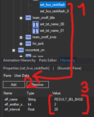
- Select the set_fxui_[etc] pane
- Select the “User Data” section
- Double click on any field to edit it.
- eff_name: the internal name of the effect, as shown in its eff file
- eff_emitter_scale: scale of emitter, not an option with most of these effect panes
- eff_interval: not entirely sure, thought it was the spawn rate of the effect/time it took for anim to repeat but not so sure on tht now
- Save it and check ingame for the changes. (I cant remember whether or not you need to do this in SLE instead of toolbox, but toolbox should work iirc)
.lc files and Programmatic UI😨
Here’s blujay’s repo for .lua (.lc) file decompilations, done by him & other contributors like Jozz.
And here’s jugeeya’s repo for the Training Mode, which uses a lot of programmatic UI. While you’re here, you should take this writeup on the Lua Managers (API) by CSK right here. Though I am not a coder, you can do some VERY cool things with .lua like HDR’s stage select page flipping/stage strike system, & basically everything related to the training mode mod. Like holy hell how do they even do it? For simpletons like me, the most I can do is reroute menu buttons. here’s an example of that:
I don't know enough about anything lua related to release a proper tutorial on it, and the edits that have been done by me are very messy & unprofessional. But hopefully I learn more abt code enough to come back & help teach folks. We’ll see.
If anyone who is competent wants to come in here and talk about it tho just hmu :’)
Specific Use Cases
This section is for all the techniques/knowledge that can help you design UI specifically for smash, though some of these techniques should carry to other games (like masking & unsharing assets).
Specific Use Case 0: Does it Matter?
The #1 question you should ask yourself when making menu UI is this: does it matter?
What I mean is, does it really matter that the hitboxes and graphics don’t align 1 to 1, so long as it still feels good to control? Does it matter if one tiny piece of your mod isn’t working, and that one issue is keeping you from releasing it on gamebanana.com (famous for it’s 100% complete & bug free mods) incase it makes the only person on earth who plays with spirits and custom balance on upset? Does it matter if other people upload stuff that seems impossible to top? While I do recommend you exercise organization and caution (to prevent you from making the mod break outright), I would say to not worry about being perfect or getting things exactly right. This is a hobby and you should have fun poking around and exploring what you can do!
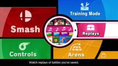
Specific Use Case 1: Masking Layers [Pict1]
Picture panes have a variety of uses, but masking may as well be considered one of the key elements of making clean custom layouts. There are several situations where masking helps, so I’ll lay some examples out for you.
- Editing an asset that’s used dozens of times that would normally take a very long time to crop manually for every use case (i.e hex shaped CSS icons or the result screen boxes)
- Previously in Smash 4, hex icons were done by manually cropping and framing each character icon, meaning it wasn’t compatible with any chara_7 type mods which edited those assets. But in Ultimate, it’s done by putting a hex shaped masking layer over the original icon’s panes & cropping the assets within automatically, increasing compatibility with other mods & remaining (relatively) simple to tweak/edit.
- Smash 4’s system was also partially due to the difficult nature of .lm editing, which lacked the same tools/documentation as .bflyt has.
- Making buttons that aren’t square with images/square & textureless panes
- Again, very useful for menu creation. a they’re a useful replacement for window panes until someone gets them working properly in a tool
- Keeping pane animations limited to a specific area/in a specific shape
- Useful for animations that work better with panes than material animations, especially to avoid ugly clamping issues or to make more complex animations
Masking comes with one real drawback: the total lack of antialiasing on the edges of the mask. They’re jagged and look rough up close if they’re curved/slanted too much. I usually make an outline for the asset and place it on top of the mask so that it looks cleaner. But this isn’t very feasible for animated masks (which is also a thing you can do in this game!!!) so ymmv.
Another minor issue with masks is that (afaik) you cannot mask something within a mask. I know that sounds like something that would never ever come up as an issue, but sometimes it’ll come up and it’ll be annoying. Maybe.
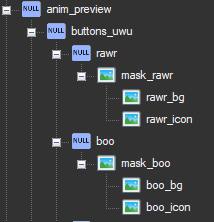
Making a Mask [Pict]
- I recommend you do this in Toolbox, as I’m unsure how useful this is for SLE where you can’t change Blend settings (spoiler: it isn’t useful in SLE)
- Create a picture pane or just make a new one (which is what i recommend) and name it “mask” or “mask_(whatever u wanna put here, not including these parentheses/quotations)”. This will be your masking layer. You’ll be parenting everything that you want the mask to affect under this layer.
- Set the texture of that picture pane to whatever you want the shape of the mask to be. it CAN be a colored image, but if you can help it i’d suggest making a B&W texture saved as a BC4-dds (it’ll save space). Just make sure that the alpha layer of the texture is what you want the masking layer to look like.
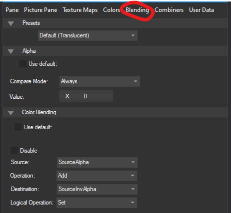
- You should still be able to see the texture at this point. That’s not okay! So now, navigate to the “Blending” tab of the pane properties (bottom left) and uncheck the boxes that say “Use default” for both alpha and the color blending. Change all those settings to match the following:
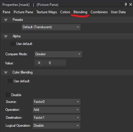
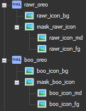
- Now, drag whatever panes you want the mask to affect onto the mask in the hierarchy. This should parent those panes to the masking layer (and you’ll be able to tell because it’ll look like this:
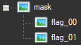
- If you followed all those steps properly, you should now have a mask working in-game! This is also a great way to make animated loading icons with fun animated patterns in them, by the way.
Specific Use Case 2: Unsharing Assets [Prt1]
In a game like Smash Ultimate, there is a lot of asset sharing. Whether it be for simplicity or saving on file space, the folks behind this game put a lot of time and effort into designing a game where they could reuse their work. Now, I’m going to show you how to completely disregard all that to make it easier on people without their dev tools or direct line to the programmers (like us!)
Unsharing assets opens up a lot of possibilities. Want to edit a menu button that doesn’t seem to be controlled by a bflyt (even though toolbox insists the part panes point to the same base bflyt? Unsharing the button assets makes it possible to have separate bflyt files for each button, and make editing them a hell of a lot easier.
- I was in the process of making a menu that fully unshared the assets for the buttons, but I ran into another technique that ended up taking me on a different path of menu creation (that’s a little more streamlined than that. But that’ll be for another time).
Aside from specific circumstances (i.e the main menu and all its shenanigans), it’s relatively easy to unshare assets.
For the vast majority of situations (excluding the infamous set of main menu buttons), there are only x steps to doing this.
- Identify the button you want to unshare in a bflyt file.
- Check the part pane & see what bflyt it points to in the “Part” area in the pane properties (it’ll have the same exact name)
- Search for that bflyt, then export it out of toolbox.
- Rename that file to something else
- Reimport it into toolbox
- Edit the name of the “Part” in pane properties to whatever you named the bflyt you just reimported
- Begin editing.
Simple, right? This setup should work for most things in the game, especially for things that never change size (like the pause menu “buttons”). But I know you’re probably here because of those menu buttons, aren’t you? Well, there’s unfortunately much more involved in that process.
The Enigma of Smash Ultimate’s Part Panes [Prt]
You can skip this section if you’d like to get straight to the “How to unshare the main menu buttons” section. But I’m documenting this because I think it’s important that in the event a toolmaker comes across this guide and reads through it for their own projects, they see this and after seeing my pain and feeling so moved by my triumph, they make a fork of toolbox or something which allows us to properly edit these parameters in full. Anyways.
The main menu’s archive has some of the most interesting layouts in the game. Not only does it employ almost every kind of pane and animation available, but it’s also home to some of the best examples of their functions (making for an excellent study sample). But of all its various pieces, there was one that took me a very long time to wrap my head around: the construction of the buttons (Smash, Games & More, Spirits, Vault, Online, & eShop). My first attempts to edit these seriously came around the time i’d first attempted to remake Project UI (when it was still based on Project M), starting with the main menu.
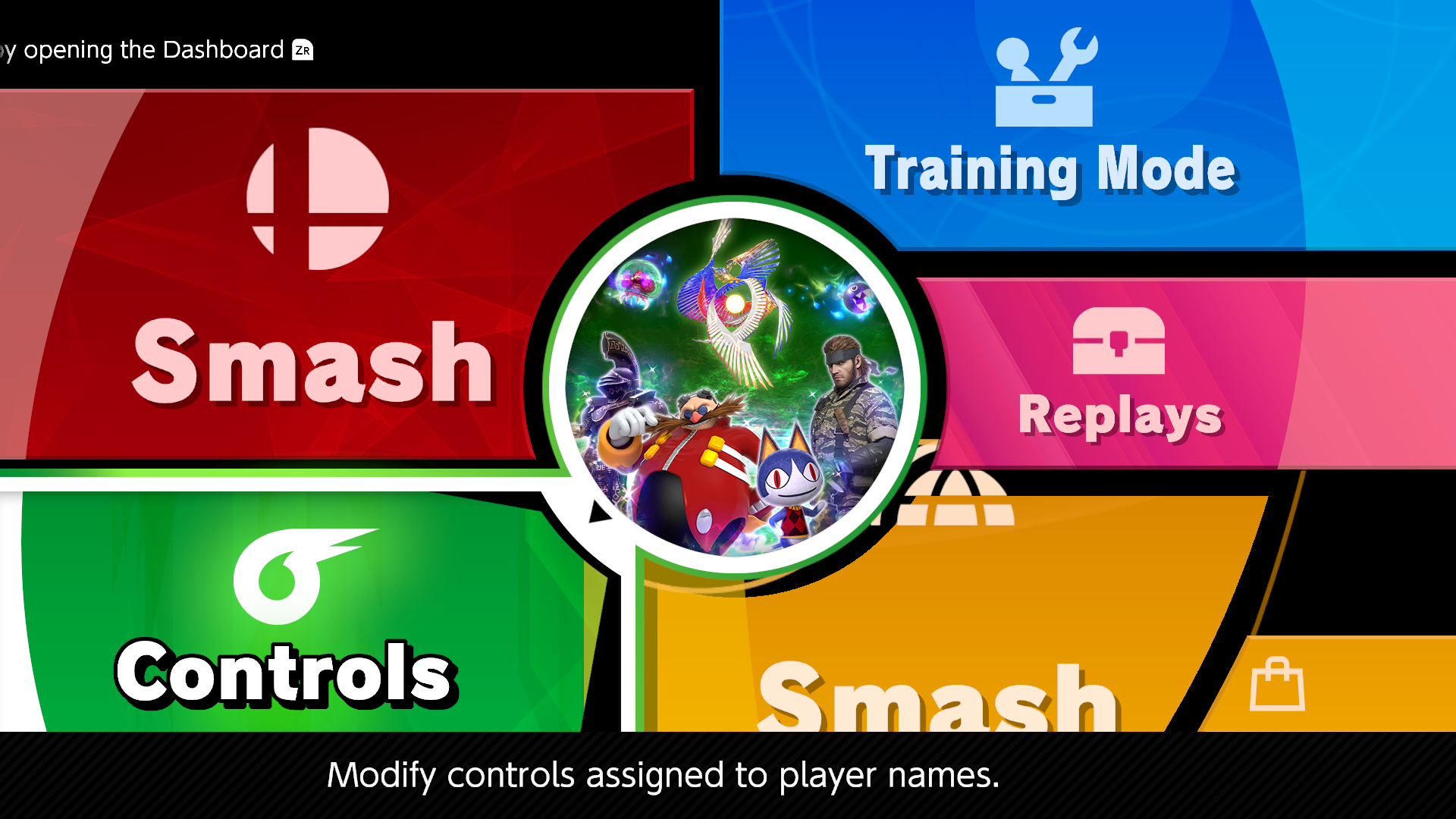
my first attempt at editing the main menu buttons
I had used the method I’d given earlier to create this, simply cloning/renaming bflyt files and changing where the part panes pointed to. But i ran into a few issues I couldn’t resolve:
- All the icons were now identical, and I wasn’t sure how to change them.
- The text sizes/dimensions were all over the place, and editing the text properties for the base bflyt files seemed to mess them all up or not do anything at all. I also couldn’t move them anywhere, really
- The materials were shared between all of them still, regardless of the changes I made inside the bflyts themselves.
- The eShop button shared the same text source as the Online button, and there was no clear way to change that.
But as we all know, I quickly abandoned this menu stuff in favor of animation/depth research, and these thoughts sunk to the bottom of the shallow little puddle in my head called a brain for quite some time. I tinkered around with the part panes for another layout, info_results_screen or however its called, but I also reached a dead end with that. Part panes had officially shown me who was boss. But that all changed when I began working with the HDR devs for their main menu. 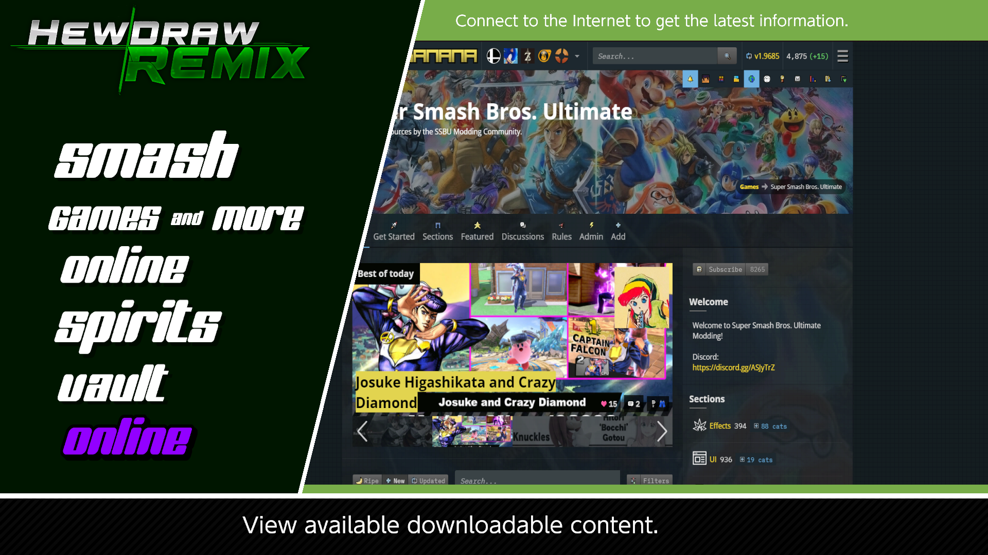
early concept for HDR’s menu (in-game screenshot)
As I began editing & moving our concepts in-game, I ran into those same difficulties. I tried accommodating for them by only using the buttons for their text, but it looked off (and would take lots of tinkering to align properly (not to mention how it'd look in different fonts/languages)) because I couldn’t change the button text’s alignment. By default, it’s set to Centered, and if I wanted the text to be aligned like a list I’d need to figure out how to make it Left Aligned. Though toolbox and SLE allow you to change the alignment of text boxes, the button textbox refused to accept any changes i made to that parameter. No matter what I edited or however many times I saved, nothing changed. Stumped yet again by this game’s UI design, I grabbed hold of the nearest hex editor and dug into the bflyt to see what was up with it.
For context, there is a limited parameter editor included in SLE and Toolbox for part panes. But (as is the case with many other things in Toolbox/SLE) it was not designed with Smash in mind. These parameters, afaik, do not really impact the end user in any way where someone would want to tamper with them (without breaking something). And even more unfortunately, the changes made in SLE refused to save for me. In Toolbox, as I found out much much later, you can only access them from the Quick Start menu. And on top of that, they don’t display all of the data involved (though it does for text panes, apparently?). Anyways, at that time nothing I did seemed to work. And if I couldn’t get past this roadblock, the HDR menu would be far more limited in what we could do with it, or it’d be put together kind of hackily & need regional/language variants (a big hassle for users and the team alike to manage). So i kept digging around looking for answers until I stumbled upon this excerpt from the 3DSbflyt docs:
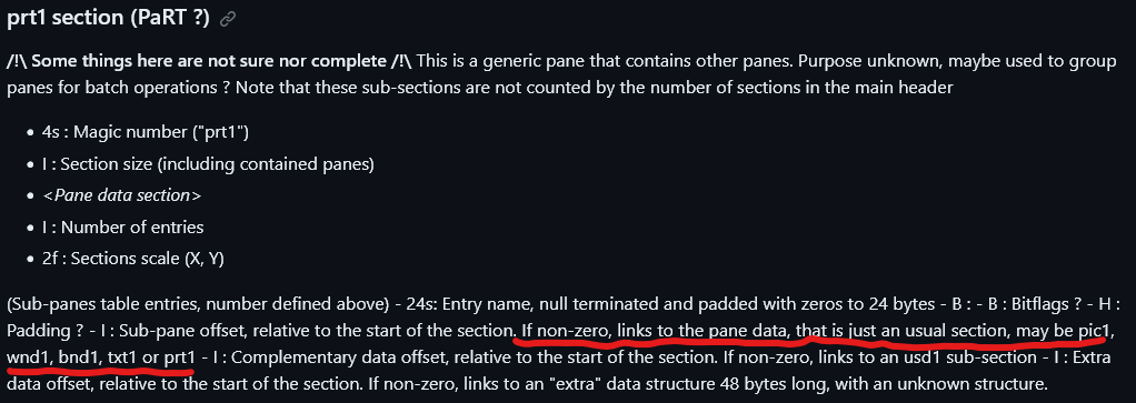
What caught my eye was the “Pane Data” section. Why would the part pane be concerned with that if its just there to point to a specific bflyt file to load up? So I went back into the bflyt and looked a little closer at the data of one of the part panes, and voila!
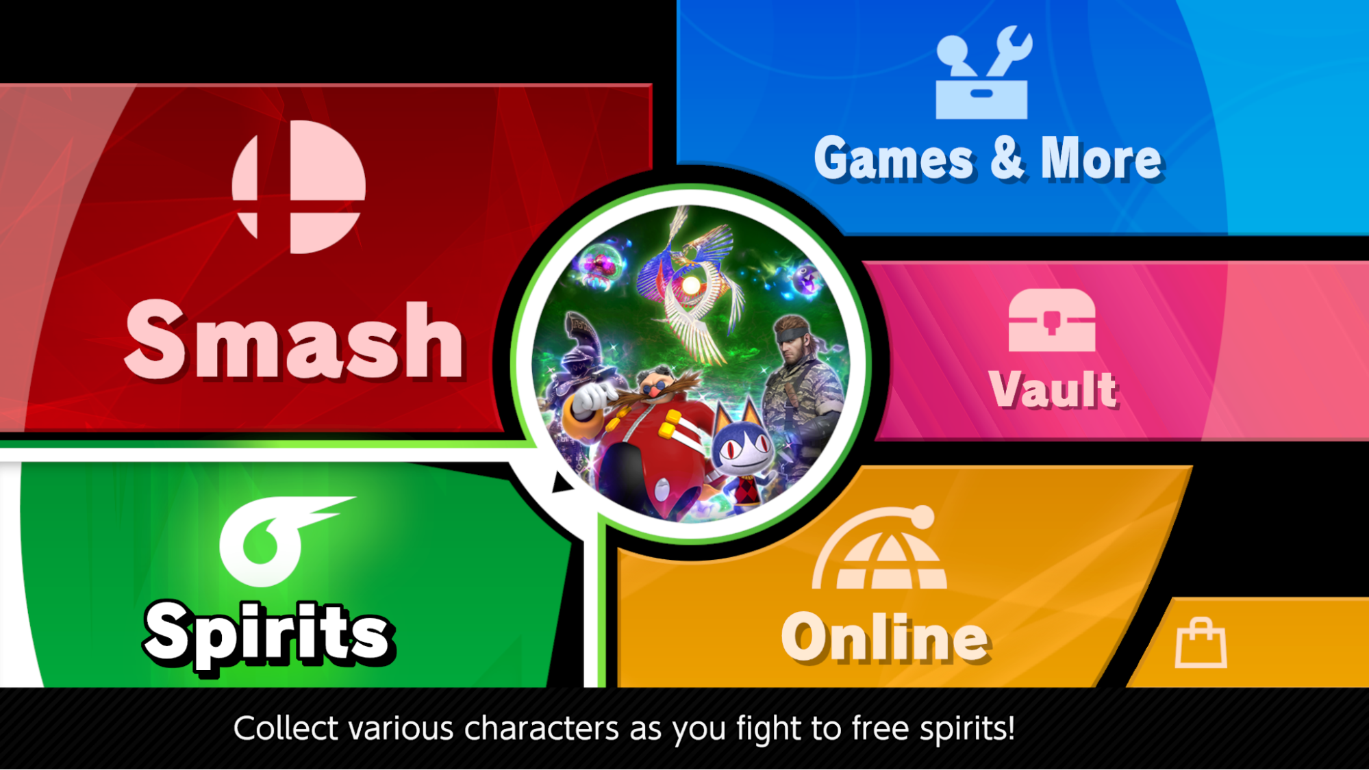
Managed to edit the scale of the Vault button text–independently of the other buttons
As it turned out, the size settings were always there; I was just unable to edit them. Hidden in depths which not even SLE (with all its strange and wonderful insights on every little bit of data) could seem to reach. This began the true “unsharing” effort that ended up being a basis of the HDR menu, and some other projects in my backlog.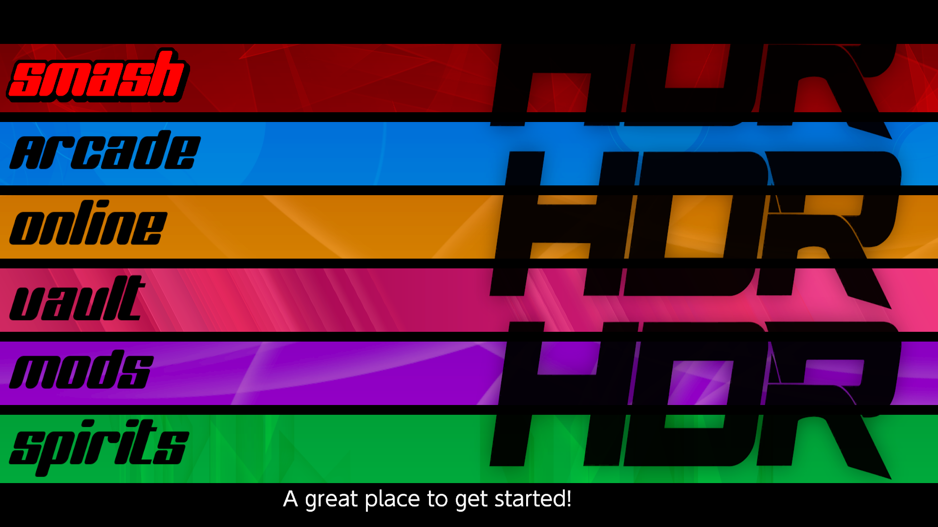
cowboy bebop inspired menu project i was working on, with proper text alignment thanks to unsharing. maybe i’ll offer the remnants to chrispo for ult S one day..?
the spirits button recreated using the hidden part pane parameters, nearly identical to the original. featured in my menu template w.i.p. i’ll finish the whole menu…eventually.
So, where are these hidden parameters exactly? And how do you go about editing them?
Specific Use Case 2.5: Unsharing the Main Menu Buttons (and other pesky part panes) [Prt1]
This process is more involved, but the basic steps are the exact same as the previous tutorial. The only difference is that in order for your changes/materials to display properly, you’ll need to blank out everything that’s related to these parameters carefully, including the labels themselves.
If you don’t have a hex editor, you’ll need one from this point forward. I recommend HxD.
- Now open up the BFLYT where the part pane is located. Do NOT make the mistake of opening the source BFLYT that the part pane points towards, because you won’t find what you’re looking for in there. This is just between you and the layout file that the part pane is inside of. Once it’s opened, look for the part pane by the name you’ve given it in toolbox (you can search by typing in the name in the text string field. For this example, we’ll be using the Games and More (known as other) part pane so I can also get some other work done (hehe).
- Once you open the layout.arc in toolbox, and then the .bflyt, you’ll be greeted by this on the left.
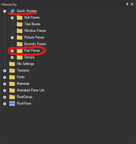
- You’ll want to discern between part and picture pane in the data. My suggestion would be to look for a “Prt” header in the Quick Access menu, cause it’ll let you search for panes by type. If you open up the Part Panes tab and scroll through, you’ll see many entries. And unlike the actual hierarchy, some of them are even expandable! Though we can’t really edit everything relevant with this tool, i do believe the text parameters carry over into the game. But everything else? Not so much, unfortunately.
- Here is what the part pane for the “Games & More” button look like (Quick Access Only):

From this, we can tell that this pane uses some hidden Part Pane Parameters. I will state that this list isn’t conclusive, & there are often other panes that are affected. In order to fully unshare them we’ll need a hex editor.
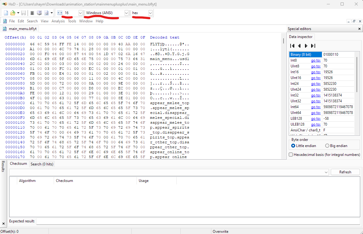
- Export the bflyt to somewhere safe, & open it up in a hex editor. Smash UI uses little endian, it that’s at all relevant to you. Here are the basic settings i use in HxD
- Search for the name of the part pane (ctrl-F) and you should come across a few results. But you will always know which one you need because the prt1 header is there!
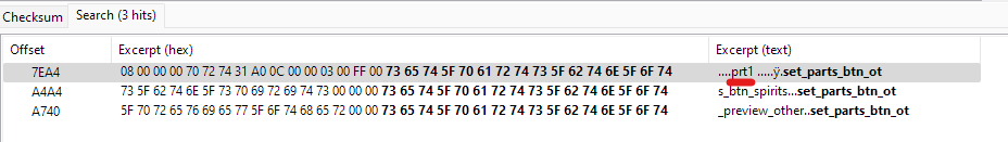
- Double click on it, or however u need to get to that area, and you should see smthn like this. Each of these underlined words correlate to a pane from the source BFLYT file, and in order for us to free this button from its part pane parameter chains, let’s zero all this data out. But be careful not to delete non-name stuff!! as long as the file has no way to know what data goes where, it’ll just ignore it. This way, if something critical goes wrong you can just restore the names to what they were (or copy the section from a vanilla bflyt and be done with it.
- When you’re done, save it and replace the source file in toolbox (as the previous guide directed you to do). Once you load it up in-game, it should look a bit broken and weird looking: that’s great! You’ve successfully unshared the button. This is a before & after for the online button (though mine looks so nice because I’d already done some tinkering with the unshared bflyt. Your unshared button will probably look like a worse off version of the Smash icon until you get things set up).
“But Maya, I just wanted to change the shape! Now all the colors are broken, the text looks weird, and the panes are in the wrong spot! What am I supposed to do now?”
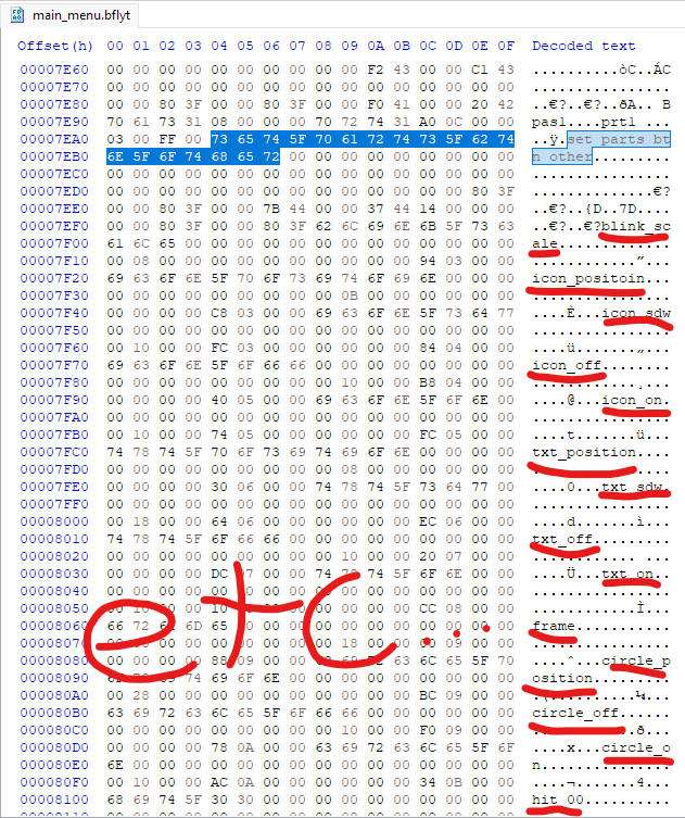
Oh, you don’t say! Well that’s the second part: if you want to make the asset keep its vanilla look (idk why you would aren’t you trying to edit it beyond recognition?), you have to scrounge around for the position data in the section directly below this one. The names should correlate directly to the panes you saw in the Toolbox Quick Access menu, and though much of it is kind of junk/blank you can sometimes find useful things (again, like the stuff for text boxes & materials). The BEST guide for where things are is the bflyt-master doc here, as they have labels & everything for all the sections & where things should be. It’s not entirely accurate to smash from what I can tell? But for the most part it’ll help you locate p much anything you need. Here’s a very brief look at some settings which i find are both consistent & listen to you in-game:
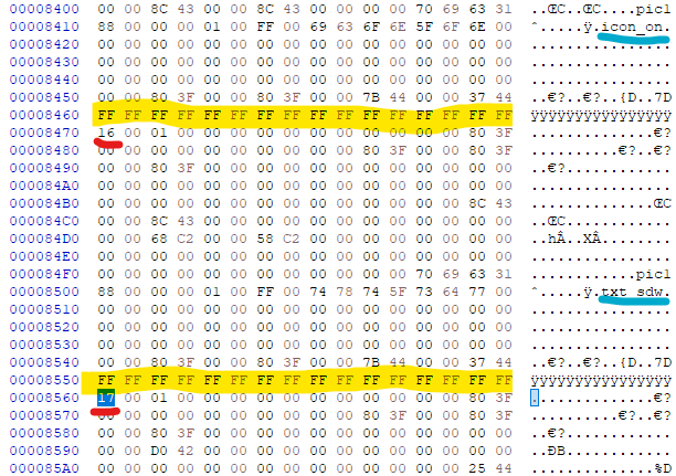
RED: materialID / YELLOW*: pane color / BLUE: name
Keep in mind, for txt panes the first 8 bytes of those “yyyyyyyy-” etc things are for top & bottom color of text (separate from material color) & the last 8 bytes are for text size iirc
And if you do it nicely, boom! You’ve not only unshared the button, you’ve reconstructed it to its former glory.
Specific Use Case 3: Persp_Mode [Prt1]
persp_mode is the setting/parameter(?) that allows you to enable depth (i.e the Z axis) in bflyt files. Before we begin, there are a few rules to keep in mind:
- This does NOT allow panes to change layers. Without code, all panes are stuck where theyre stationed in the bflyt.
- This is because of the way the game initially handles UI depth (based on load order). You need a code based solution to change who overlaps what any time after the file is loaded up into the game. This is best shown in the Stage Select screen, which uses a code-based technique to allow selected stage icons to grow and shrink a little.
- When/if you aim to construct 3D objects, remember that you’re working with flat planes rather than polygons. There are no “alternate shapes” of panes, only squares. But you could probably put a triangle texture on it and it’d work more or less the same.
- A major bummer of this tech is that depth is not consistent like it is with a traditional cube, and it functions alot more like a perspective tool in photoshop (imitated depth) vs a “true” 3D object with actual consistent depth. Though this can be worked around with animations, there is a great amount of work involved to keep the illusion from being compromised.
- Take the default cube in blender, for example. if you colored each side a different color & began rotating it, you’d still expect each side to be colored appropriately, right? if the back of the cube was blue and you rotated it around, it’s expected that you’ll be met with that blue side of the cube. But with Perspective Mode, what you see depends on the priority that specific pane holds in the hierarchy. And since it’s inconsistent, it may not be the best idea to make things do full rotations. However, I’m sure you wouldn’t break the illusion if you only tilt it a little in your animations.
persp_mode in action. here’s the first (?) ui2d rotating cube!
Also, at this time it is ONLY possible to enable this via Switch Layout Editor. So go ahead and download that if you havent already.
Enabling Perspective Mode [lyt]
- Open the bflyt you want to add persp_mode to in SLE. You can add the entire arc via drag n drop if you’d like, as well.
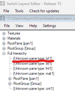
- Double click the bflyt you want to open, & a new window will open with the hierarchy in the same spot as Toolbox. Expand the “Full Hierarchy” tab and you’ll see a bunch of things listed. We’re only concerned with the “lyt1” unk pane today.
- Click on it, and at the bottom left there will be a little information regarding it. Click the three little dots at the very end of the “Collection” line, and it’ll open the User Data section. YIPPEE! This bflyt already has the entries laid out properly, but you’ll need to add them to any bflyt that doesn’t normally support them (basically all of them).
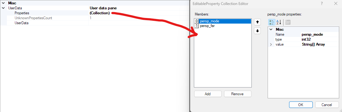
- Here are the settings, for your quick reference in the future:
(for string arrays, just expand them in the table. you can add data to it)
- 0: persp_mode
- Name: persp_mode
- Type: int32
- value: String[] Array
- It should be “1” (only type the number not the “”)
- 1: persp_far
- Name: persp_far
- Type: single
- Value: String[] Array
- It should be a biiiiiig number. I use “80000” but I’ve also seen “20000” in the wild. (and still, only type the number not the “”
- Here are some swaggy examples (most of these are rough showcases or W.I.P!)
the w.i.p stage select screen from project ui2k
some misc examples i did for fun
Specific Use Case 4: Hybrid Menus [Main Menu]
As many of you know, there is already a tutorial on gamebanana for making menus traditionally. This involves editing the buttons and their materials, and moving/arranging those buttons around. However, for HDR and project ui2k, I’ve developed an alternative approach to menu making that (imo) is easier to make, edit, and visualize within the current tools. Introducing (for like the third time): Hybrid Menus.
What is a Hybrid Menu?
All parts of the main menu have either a “selector” bflyt or a preview bflyt (normally used for the images that show up in the corners of the menu). A Hybrid menu is one that moves the majority of menu elements (i.e buttons, backgrounds, etc) into those bflyt files in order to access their button specific animations, which can also affect other things in the screenspace. For instance, a menu like this is only possible with tech like this (or code edits to add an animation call for it, probably. But I’m not a coder so I have to work around these problems in my own way).
this is NOT a part of ui2k. this is merely concept exploration
Although you can’t really put the hitbox data
As I said earlier, this is more of an “approach” than something entirely new or original. A Hybrid menu is a way to exploit how the base game sets up the (main) menus to simplify creation through reorganization/restructuring. Instead of editing menus on a bunch of separated bflyt files and bflans & trying to juggle all those, you could just build your own menu on a single one with a single set of bflan files for each button. This is useful for a couple different reasons:
- Less juggling files & a more centralized menu
- More direct control over buttons and other menu aspects, since everything can be changed by one button specific bflan animation (vs split into several isolated parts as it is in the base game)
- Much better suited for list-like menus (imo)
- Toolbox hates to render the menu in the vanilla game, but fitting as much of the menu as you can onto one bflyt makes it look much prettier & easy to identify. Another positive is that animations for buttons play properly in the tool this way, which is always welcome for big overhaul things.
a comparison between the vanilla main menu’s base & the main menu’s base for ui2k. notice how it’s using the selector’s bflyt and not the main_menu one!
- BFLAN files may have much larger counts of entries when you do this, depending on what you’re doing & how many animations you’re adding.
- But with the JSON export tools in SLE available, you could probably copy-paste entries around and have a lot less trouble than I did
- Since each button specific bflan file for the selector/preview bflyt files can affect the entire screen & not just that one button, deselection animations that last more than one keyframe will not work well with this method since it’ll play every time you select another button, not just when you stop selecting it (which could look jarring).
- Of course, you can still make these menus look & feel natural and not jarring. But just keep in mind that you’re kind of cooked on deselection animations unless you only have two buttons or something
Now, the reasoning behind the Hybrid part of the name is that certain things are restricted to individual BFLYT files, like hitboxes. It’s also because i think it works best in tandem with normal menu editing procedures, and finding new ways to incorporate pieces of the menu for new things. Let’s look at an example.
Project ui2k’s Hybrid Menu [#notsponsored]
For the uninitiated, this is an ui overhaul mod I’ve been working on. You can view the trailer here.
This main menu is much different than the vanilla one, and has many unique animations. Under the hood, the whole menu has been reorganized to accommodate for the new design.
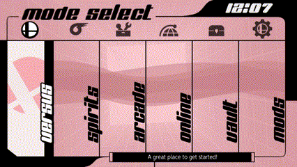
scrolling through the various buttons on the main menu screen for ui2k.
the animations for the versus button aren’t shown here, but it was prolly
my favorite one to make.
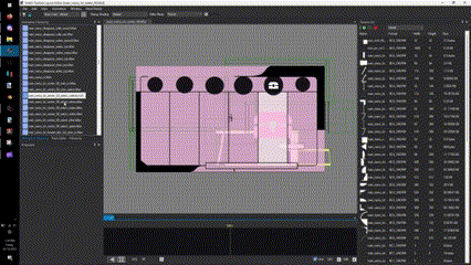
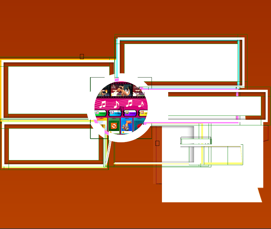
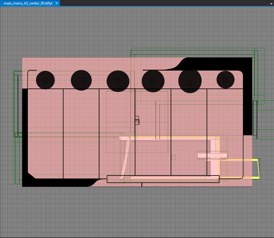
here’s what it looks like in toolbox. you can actually see whats going on!?
Unlike the vanilla main menu, the graphics for buttons (aside from the text and the black bar behind the text) are located within the selector bflyt (main_menu_btn3_00). As you can see, it looks almost 1 to 1 with how it looks inside toolbox, and i can honestly say I wouldnt have gotten as far as I did that fast without restructuring the bflyt like this.
some examples of how these files are laid out. not a single window pane
in sight!
Also, I cannot stress enough how important organization is for large projects like this. Being able to solve layering issues immediately, viewing animations in their context without loading up the game, it’s very useful in the long run. Although Hybrid menus come with some drawbacks (as listed above), I think they’re well worth looking into for anybody interested in making menus.
Speaking of drawbacks, animation length. Though this is very dependant on the kind of menu you’re making, you will need to be very good with animations to get the most out of this & they
may drag on long. For instance, this is probably my longest animation for a list style menu:
Granted, this isn’t even that long compared to some animations. As long as you make sure that you have the button turn your selected one on & play the relevant animations, and turn the other ones off, you’ll probably be fine. But these can get much longer when you try making more traditional smash menus that aren’t so linear, where you need to make animations turn off all visible buttons aside from the one you’re selecting every time you move the cursor.
Comments Section [Future Topics/Suggestions]
And just like that, that’s all I’ve got to say for now1! Like my BFLAN tutorial, I’m going to keep comments enabled incase someone wants some clarification/elaboration. And this time, I’ll make a designated comments section here. Highlight one of the topics & comment onto it (if ya want) so I can get to you faster. Thanks!
- General Comment/Question
- Texture Question
- Materials Question
- Groups Question
- Panes Question
- Specific Use Case Question/Request